4 minutes read | Dec 23, 2024
Imagine sitting in a boardroom, the air buzzing with anticipation. On the screen appears a deck—polished, precise, and purposeful. As the first slide unfolds, the audience is captivated, sensing this presentation is unlike the rest. It’s clear: this is the work of McKinsey.
McKinsey & Company, a global consulting powerhouse, is renowned not only for its strategic insights but also for its unparalleled presentations. A McKinsey deck isn’t just a collection of slides; it’s a masterpiece of communication. Let’s delve into the anatomy of their presentations to understand what makes them so impactful.
Aesthetic Minimalism
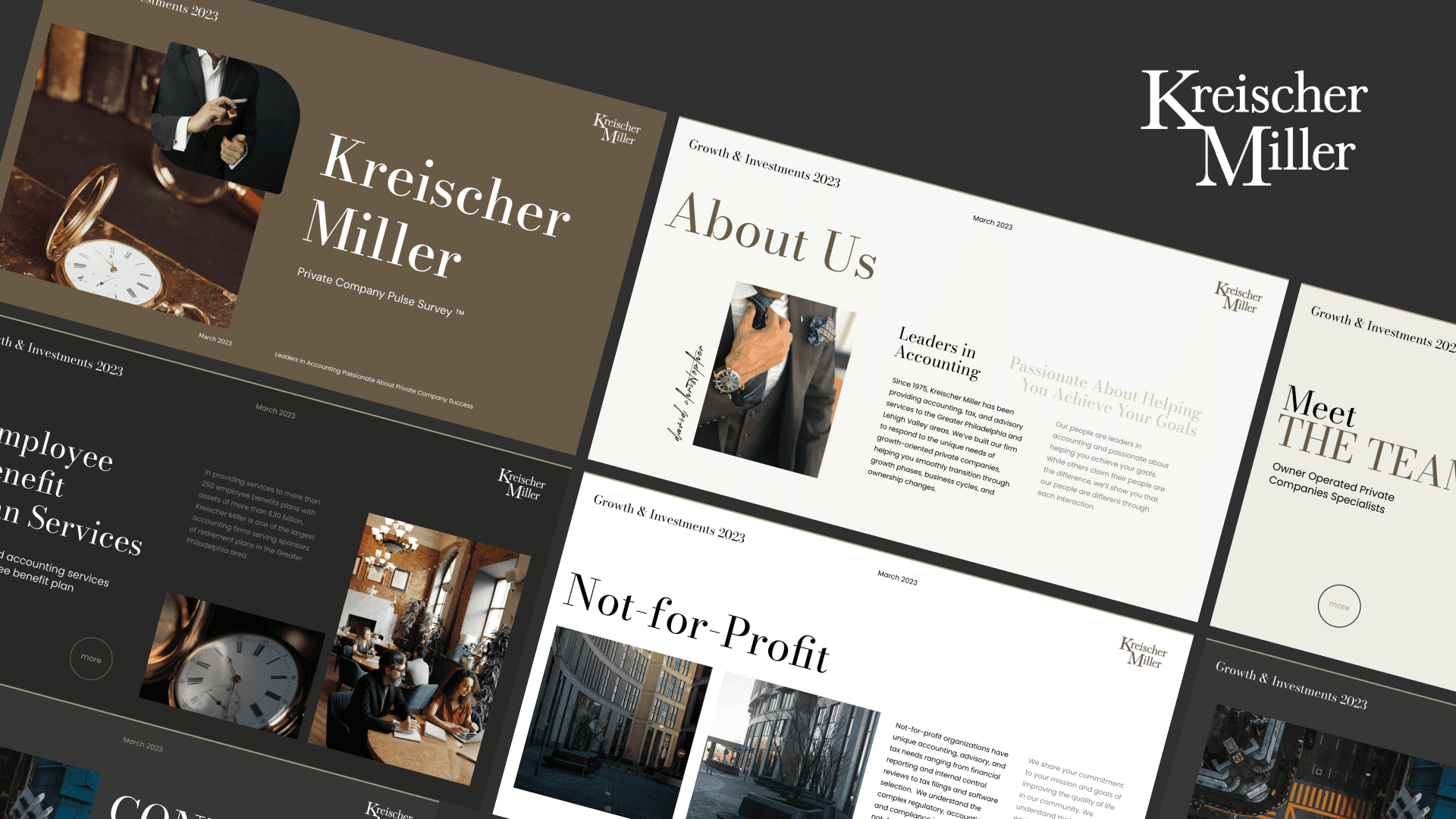
McKinsey presentations exude simplicity. From the clean, uncluttered designs to the restrained color palette, every element serves a purpose. Minimalism in their decks isn’t just an aesthetic choice; it’s a strategic one. By eliminating distractions, they ensure the audience’s focus stays on the message.
Consider their choice of fonts: professional, readable, and uniform. Their slides don’t compete for attention with elaborate graphics or vibrant colors. Instead, they draw the audience into the narrative with understated elegance. This minimalist approach reflects McKinsey’s professionalism and their respect for the audience’s time.
Structuring for Clarity
One of the hallmarks of a McKinsey presentation is its structure. They know their audience is busy, often composed of senior executives with limited time. To address this, they adopt a logical and layered approach to organizing content.
Each deck typically begins with a title slide that sets the stage. Next comes the executive summary, distilling the entire presentation into a few concise points. This is followed by the body slides, which delve into the details while maintaining a clear progression of ideas. By the end, the audience has not only understood the core message but also seen the evidence behind it.
Every section of a McKinsey deck is like a chapter in a book—clear, purposeful, and easy to follow. This disciplined structure ensures the presentation flows smoothly, guiding the audience from one insight to the next.
Storytelling with Purpose
Data alone doesn’t move people. Stories do. McKinsey understands this, which is why their presentations are built on compelling narratives. Every slide contributes to a broader story, tying together insights, solutions, and outcomes.
For example, if the presentation focuses on a company’s growth challenges, it might start by painting a picture of the current landscape. From there, it leads the audience through the problem’s root causes, backed by data, and culminates with actionable recommendations. This approach ensures the audience remains engaged, invested, and eager to act.
Mastering Visual Simplicity
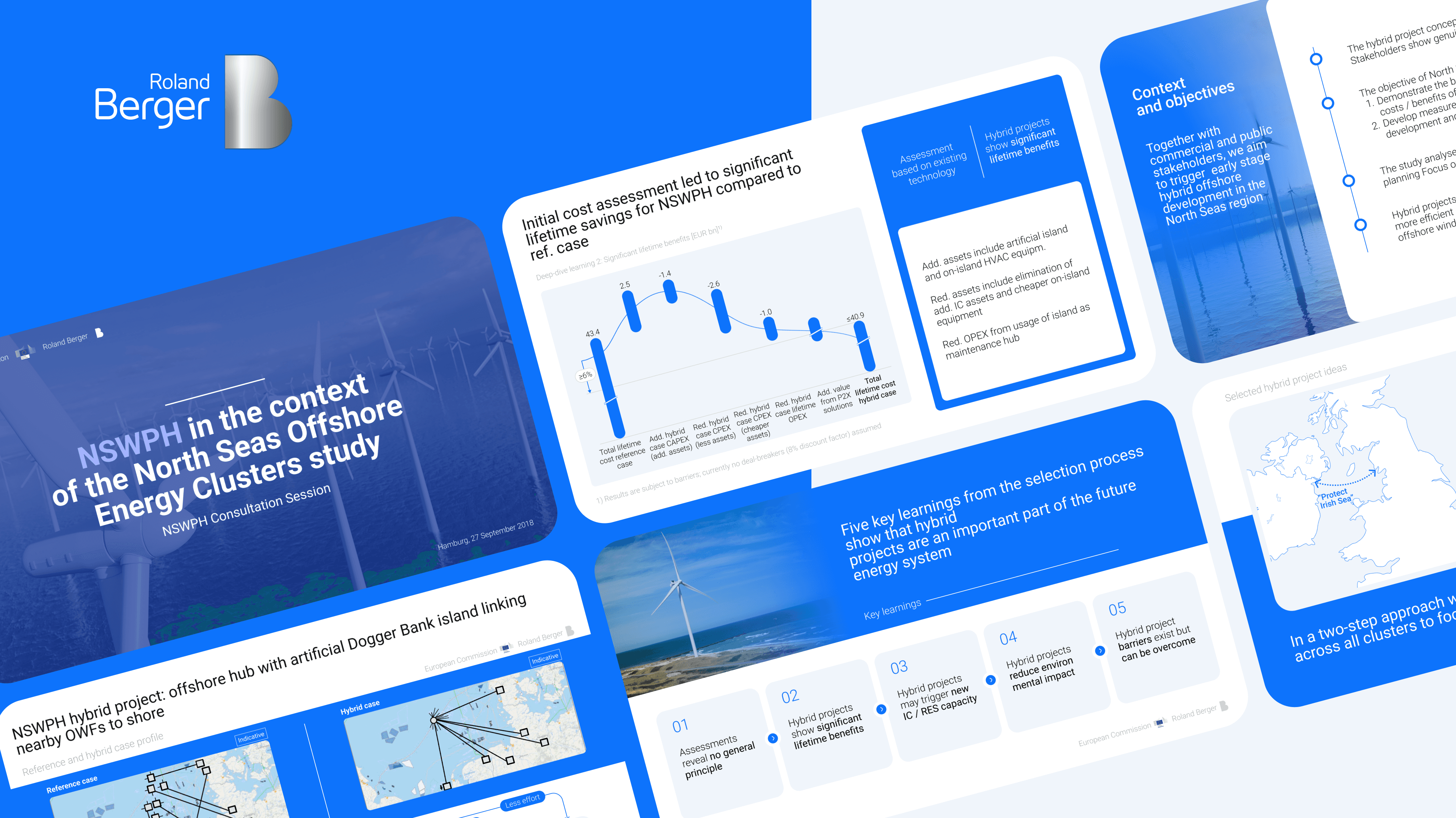
Complex data can easily overwhelm an audience. McKinsey’s approach to visuals ensures this never happens. Their charts, graphs, and tables are designed for clarity and impact.
Instead of showing large spreadsheets, they turn data into easy-to-understand visuals.A bar chart can show trends over time, while a pie chart clearly breaks down market share. Visual hierarchy is key: the most critical information stands out, while supporting details remain secondary.
Take, for instance, their use of annotations. Instead of expecting the audience to interpret a graph on their own, McKinsey presentations often include brief, clear explanations directly on the slide. This helps bridge the gap between raw data and actionable insight, ensuring every slide resonates with its viewers.
Delivering with Confidence
The magic of a McKinsey presentation isn’t confined to the slides themselves. It’s also in how the story is delivered. Their consultants exude confidence, not arrogance, ensuring their message is received with trust and respect.
This confidence stems from preparation. McKinsey consultants rehearse extensively, anticipating questions and refining their delivery. They use clear language, avoiding jargon that might alienate their audience. Their tone is measured, their pacing deliberate, and their visuals perfectly timed to their narrative.
When presenting, they focus on the audience—making eye contact, responding to cues, and adapting as needed. This approach transforms a static deck into a dynamic dialogue, creating a sense of collaboration and mutual understanding.
Why It Matters
The excellence of McKinsey’s presentations isn’t accidental. It’s the result of meticulous design, strategic thinking, and a deep understanding of their audience. Their decks don’t just inform; they inspire action.
For businesses and individuals alike, there’s much to learn from their approach. Whether you’re pitching an idea, sharing insights, or persuading stakeholders, adopting McKinsey’s principles can elevate your presentations to new heights.
Looking Ahead
In this exploration, we’ve uncovered the elements that make McKinsey presentations exceptional—their minimalism, structured clarity, storytelling prowess, visual simplicity, and confident delivery. Each component plays a vital role in creating a seamless, impactful experience.
In future articles, we will dive even deeper, uncovering other fascinating aspects of McKinsey’s presentation approach. Stay tuned for more insights that can transform the way you communicate.
Need a presentation like McKinsey? Slide Smiths can help. To contact us today (click here) and let’s create something extraordinary together.


